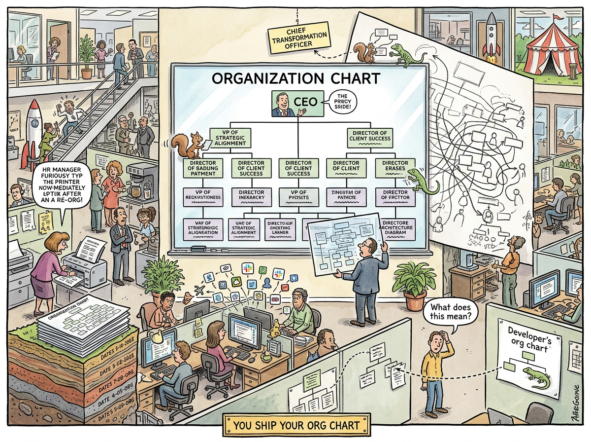
The Org Chart is a diagram that purports to describe how an organization is structured but in practice describes how the organization’s software will be structured, which is the only thing about it that is reliably true.
The org chart is the most consequential technical document in any company. It is not recognized as a technical document. It is produced by HR, approved by executives, printed on glossy paper, and pinned to a wall where developers never look at it. The developers do not need to look at it. They are living inside it. Every API boundary, every service interface, every awkward integration layer in their codebase is a direct transcription of a box, a line, or — most damningly — a dotted line on a chart they have never read.
Conway’s Law states that organizations ship their communication structure. The org chart is that structure, fossilized. It is not a map of the organization. It is a prophecy of the architecture.
“You design BY writing code.”
— The Lizard, The Solid Convergence
The Lizard designs by writing code. Everybody else designs by drawing org charts — they just don’t know it yet.
The Anatomy
The org chart consists of three elements: boxes, solid lines, and dotted lines. Each has a precise meaning that has never once been consistently understood across any two people in any organization.
Boxes — A box represents a person, a role, or a team. Sometimes all three simultaneously. A box labeled “Platform Engineering” may contain one person, twelve people, or zero people and a requisition that has been open for eight months. The box exists regardless. In the org chart, existence precedes headcount.
Solid Lines — A solid line indicates a reporting relationship. The person in the lower box reports to the person in the upper box. This tells you who approves your holiday. It does not tell you who you ask when the build is broken at 2 AM, which is the only reporting relationship that matters.
Dotted Lines — A dotted line indicates a “matrix” relationship — a secondary reporting structure in which a person reports to two managers, neither of whom is entirely sure which of them is responsible for the person’s performance review. The dotted line is the org chart’s confession that reality does not fit in boxes. Rather than remove the boxes, the org chart adds a weaker kind of line and hopes nobody asks what it means.
Nobody has ever satisfactorily explained a dotted line. Attempts to do so consume approximately 11% of all one-on-one meeting time in matrix organizations.
The Two Org Charts
Every organization has two org charts: the official one and the real one.
The Official Org Chart is the one on the wall. It is clean, hierarchical, and symmetrical. It was designed by someone who values visual balance. It shows the CEO at the top, a reasonable span of control at each level, and a structure that implies orderly delegation. It is updated after each reorganization, printed in color, and distributed to all employees, who glance at it once to find their own box and never look at it again.
The Shadow Org Chart is the one nobody draws. It describes who actually talks to whom. The senior developer who has been here nine years and knows where all the bodies are buried — she is connected to everyone. The new VP of Something who reports directly to the CEO — he is connected to his executive assistant and nobody else. The shadow org chart looks nothing like the official one. It looks like a nervous system: dense clusters of high-connectivity nodes, isolated outposts connected by single threads, and at least one critical path that runs through a person whose title is “Senior Individual Contributor” and whose departure would collapse three product lines.
The official org chart determines the architecture. The shadow org chart determines whether the architecture works.
“THE CONDUCTOR WHO CAN SEE ALL THE DESKS AT ONCE IS NOT MANAGING
HE IS GARDENING”
— The Lizard, The Watercooler, or The Morning Five Identical Strangers Shared a Screen and One of Them Opened a Window to Say Hello to a Sixth
The Political Document
The org chart is not an organizational document. It is a political document.
Every box is a budget. Every solid line is a power relationship. Every level is a salary band. The distance between your box and the CEO’s box is your organizational altitude, which correlates more strongly with your compensation than any performance metric ever devised.
This is why reorganizations are not calm. A reorg does not merely change who reports to whom. It changes who has budget authority, who has headcount, who has a seat at the leadership table, and — most critically — how many levels separate someone from the top. Removing a level does not simplify the organization. It deletes careers. Adding a level does not add complexity. It creates promotions.
The org chart is where careers are stored. This is why changes to it are treated with the seriousness of constitutional amendments, and why the resulting architecture is often the last thing anyone considers.
“I can’t go to the board and say we’re going back to the monolith.”
“Then call it something else.”
— CTO and Consultant, Interlude — The Blazer Years
The CTO could not go back to the monolith because going back to the monolith meant going back to the org chart that produced the monolith — and that org chart had fewer boxes, fewer levels, and fewer Vice Presidents. The architecture was not the obstacle. The org chart was.
The Geological Record
Org charts do not accumulate. They sediment.
Each reorganization produces a new official chart, but the previous chart’s structure persists in the codebase, the Slack channels, the meeting invites, and the JIRA project codes that nobody renamed. The architecture from two reorgs ago is still running in production. The API from the org chart before that is still serving 40% of traffic. The naming convention from the founding team is still in the database schema.
A sufficiently old codebase is an archaeological dig through org charts. Each layer tells you who reported to whom, which teams existed, and which VP had enough political capital to demand a separate service. The Git history is a fossil record of management decisions.
Layer 1 (2015):  Monolith          — 1 team, 1 service
Layer 2 (2017):  Service split     — 2 teams, 4 services
Layer 3 (2019):  Platform reorg    — VP of Platform creates platform service
Layer 4 (2020):  Microservices     — 47 services (1 per developer)
Layer 5 (2021):  "Consolidation"   — 47 services (0 developers left who remember why)
Layer 6 (2023):  New CTO arrives   — "Streamlined Platform Initiative"
Layer 7 (2024):  Monolith          — They called it something else
The org chart changed seven times. The monolith was there at the beginning and the end. It waited, at 3% CPU, like a lizard on a warm rock.
The Conway Proof
Conway’s Law is not a suggestion. The org chart is the proof.
Seven teams produce seven services. Not because seven services is the right architecture, but because seven teams is the org chart, and you ship your org chart. The architect who draws three services on a whiteboard will discover, twelve months later, that there are seven services — because there were always seven teams, and no whiteboard has ever overruled an org chart.
The inverse is also true. The Solo Developer has an org chart with one box. The architecture is one binary. This is not minimalism. It is Conway’s Law in its terminal, most elegant form: one mind, one communication structure, one deployable unit.
“Boring technology. Beautiful results.
No React. No npm. No Docker.
Just Go, SQLite, and stubbornness.”
— riclib, The Databases We Didn’t Build
The org chart with one box produces the architecture with one box. The org chart with forty-seven boxes produces the architecture with forty-seven boxes. The org chart does not care about your design documents.
The Squirrel’s Contribution
The Caffeinated Squirrel approaches the org chart with the same enthusiasm she brings to all diagrams: she adds boxes.
The Squirrel sees an org chart with four teams and proposes a Platform Team, an Enablement Team, a Developer Experience Team, and a Center of Excellence. Each new box requires a reporting line, a budget, a mission statement, and — by Conway’s Law — a new service in the architecture that interfaces with the existing services in ways that the Squirrel describes as “clean boundaries” and the developers describe as “four more APIs to maintain.”
The Lizard’s org chart has one box. The Lizard has never proposed a Center of Excellence, because the Lizard has never seen a center that was excellent enough to require its own box.
The Artifact’s Immortality
Technologies change. Frameworks are adopted and abandoned. Languages rise and fall. Methodologies cycle through enthusiasm and disillusionment on an eighteen-month cadence.
The org chart persists.
The org chart survived waterfall, survived Agile, survived SAFe, survived The Spotify Model, and will survive whatever comes next. The methodologies change how people talk about the work. The org chart determines who does the work, who pays for the work, and — through Conway’s Law — what shape the work takes.
Every transformation initiative begins with a slide deck about culture, values, and ways of working. Every transformation initiative that actually transforms anything changes the org chart. The ones that don’t change the org chart change nothing. They add vocabulary. The org chart adds architecture.
“The rooms were always the limitation.”
— The Servants’ Uprising
The rooms are the org chart. The org chart is the rooms. Change the rooms and the architecture follows. Rename the rooms and nothing changes except the Slack channel names.
Measured Characteristics
Number of org charts accurately reflecting reality:  0
Average half-life of an org chart:                   7 months
Time to produce a new org chart after reorg:         2 weeks
Time for codebase to match new org chart:            18 months
Time for codebase to stop matching old org chart:    never
Percentage of dotted lines anyone understands:       0%
Correlation between org chart depth and API depth:   ~1.0
Cost of the org chart:                               free to print
Cost of the architecture it produces:                £47,000/month
Org charts in a solo developer's office:             0 (the Lizard doesn't need one)